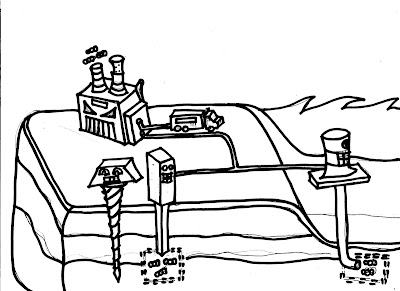
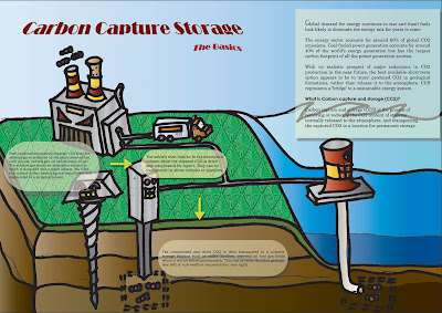
A lot of people might find this sort of technological terminology boring and get turned off. Hence i decided to add the cute factor in my infograph to attract their attention, to educate them about this ardous process of storing carbon dioxide. Mainly to encourage easy reading.
Outlines
Critiques
Too wordy. I didnt realise it is supposed to support an article and be placed in the article to complement the texts. I thought it is a stand alone "poster".
Another comment was that all the activities seem to be happening on land, so there is no need to give much emphasis on the water/sea, so i can actually dedicate more canvas space for the land instead of the sea. Jing also mentioned another about the art perspective (which i know, i'm bad in drawing.)- that the sea do not start at the top corner of the land, but is supposed to start lower.
Also, the titled style of the title doesnt seem to be well-liked, so since it doesn't serve any purpose besides the aesthetic part, I decided to change it, and I placed it in the centre instead.
So yup, after final edits:
Final Prototype
How the portfolio will look like with it
In the end, I gave more space to the land, change the waves, i've even inserted a sample article that incorporates the fun-looking infograph to give the seemingly boring article a new leash of life! =)


No comments:
Post a Comment