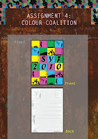
Pop Art style, shades of purple, blue, red. (complementary colours) whispering colours are used too (pastel colours). location of colours are also considered, whether the colours are arranged horizontally or diagonally. Different tones are tried too, eg. metallic scheme and earth scheme.
I chose pop art colours in the end because it has the loud component that i hope it can convey the dynamic component in youth to the general public. Grunge background, symbolising the hidden rebellion factor that is characteristic of youths these days, is used together with the different motifs (each representing the CCAs that makes up the different genres in the festival) to form the back of the postcard.
Critiques
The title- SYF 2010 might look better if it is positioned more towards the centre, since that's the main thing I want people to know- the existence of SYF 2010 + Vibrancy.
Jing also mentioned about the different sizes of SYF, and 2010.
Absorbing these points, I had a final edit:


No comments:
Post a Comment