This is probably the last post I'm gonna have; Would just like to extend my thanks to my lecturer, tutor, groupmates, printing uncles and aunties who play a role in learning about visual representations this semester. It's been really fruitful, learning how to use the different adobe softwares, and most importantly, how to view things from different perspectives. =)
I'm looking to take another similar module. soon digital photography! =)
Just a link to share, hope everyone can learn as much as i do!
http://vector.tutsplus.com/articles/inspiration/40-free-tutorials-on-advanced-drawing-techniques/
Sunday, April 11, 2010
Final Edits
Was doing some final touch ups in preparation for my portfolio!
Assignment 3: changed the ending, into something that's funny- instead of finding the right girl, the guy ended up meeting his penpal- a guy (and perhaps gay.)
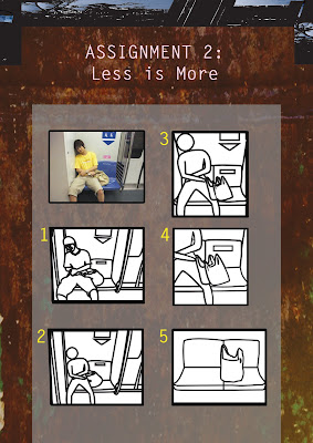
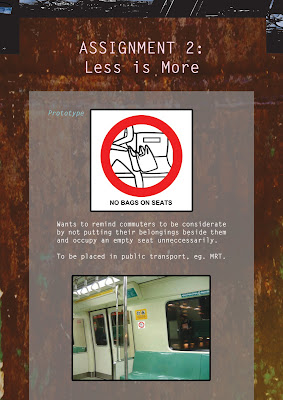
Assignment 2: changed my order of abstraction to include the zooming in of scene, and retain the human so that the message will not be confused with "do not leave your belongings behind".
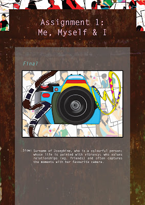
Assignment 1: I diligently choose to do something about the 'S' after much comments saying that my 'S' is not obvious enough. Used film strips in the end, hope it helps!
Monday, April 5, 2010
Final Project: Children's storybook
POP CULTURE! to debunk the stereotype of fat people, that's our team's aim. "WHY ARE THERE NO FAT PRINCESS STORIES" was the main inspiration for our story. WE WILL GIVE THEM ONE FAT PRINCESS STORY- never to judge people by their appearance! (It does sound like some rallying calls I admit. lol.)


Stepsister Tricia and Stepmother

Mabel!

Sketches


We use rule of thirds for some of our compositions, and use mainly block colours with minimal gradients to attract the attention of 7-9years old readers. =))) Fat Mabel FTW!
Storyline (the gist of it) : Mabel was fat but kind, soon had low self esteem due to constant criticisms from her stepmother and stepsister. She was sabotaged by her sister during one journey, where she rendered help to an ugly man who is actually a fine looking prince in disguise. The couple eventually married and they lived happily ever after.
We have some charater development:


Ugly man vs. Prince Tyler


Stepsister Tricia and Stepmother

Mabel!


Sketches
and these are some of the final storybook excerpts:


We use rule of thirds for some of our compositions, and use mainly block colours with minimal gradients to attract the attention of 7-9years old readers. =))) Fat Mabel FTW!
Sunday, April 4, 2010
Assignment 5: Fighting Climate Change
I came across this article in Times magazine while seaching for inspiration for this assignment. "THE NEXT BIG THING for global warming, not just recycling, save this and that, and some almost non-exsistent protocols but something concrete, that scientists said it's actually workable," i thought. GEOENGINEERING. sounds like playing with nature, but i thought it was pretty cool, so i went to research about this particular method of reducing carbon dioxide- by storing them- Carbon Capture Storage method.

Article!
A lot of people might find this sort of technological terminology boring and get turned off. Hence i decided to add the cute factor in my infograph to attract their attention, to educate them about this ardous process of storing carbon dioxide. Mainly to encourage easy reading.
Outlines

Prototype
Critiques
Too wordy. I didnt realise it is supposed to support an article and be placed in the article to complement the texts. I thought it is a stand alone "poster".
Another comment was that all the activities seem to be happening on land, so there is no need to give much emphasis on the water/sea, so i can actually dedicate more canvas space for the land instead of the sea. Jing also mentioned another about the art perspective (which i know, i'm bad in drawing.)- that the sea do not start at the top corner of the land, but is supposed to start lower.
Also, the titled style of the title doesnt seem to be well-liked, so since it doesn't serve any purpose besides the aesthetic part, I decided to change it, and I placed it in the centre instead.
So yup, after final edits:
Final Prototype

How the portfolio will look like with it

In the end, I gave more space to the land, change the waves, i've even inserted a sample article that incorporates the fun-looking infograph to give the seemingly boring article a new leash of life! =)
Assignment 4: Color Coalition
Since the theme is centred around youth, I decided to venture into SYF, which I feel that it can be improved from the dry and boring feel. I wanted to add vibrancy to the festival, hopefully it can be as vibrant as noise singapore.


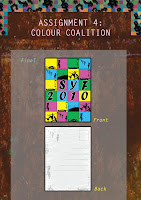
I decided to change the colours of SYF 2010, so that the colours will not compete with the colourful background. Each number in 2010 are given equal weightage now, and overall it looked more balanced. =)

Pop Art style, shades of purple, blue, red. (complementary colours) whispering colours are used too (pastel colours). location of colours are also considered, whether the colours are arranged horizontally or diagonally. Different tones are tried too, eg. metallic scheme and earth scheme.

I chose pop art colours in the end because it has the loud component that i hope it can convey the dynamic component in youth to the general public. Grunge background, symbolising the hidden rebellion factor that is characteristic of youths these days, is used together with the different motifs (each representing the CCAs that makes up the different genres in the festival) to form the back of the postcard.
Critiques
The title- SYF 2010 might look better if it is positioned more towards the centre, since that's the main thing I want people to know- the existence of SYF 2010 + Vibrancy.
Jing also mentioned about the different sizes of SYF, and 2010.
Absorbing these points, I had a final edit:

Wednesday, March 31, 2010
Lecture Assignment (Again)
This time round we need to come up with abstractions to express meanings of words. Using simple lines and strokes, Timothy and I decided come up with some:
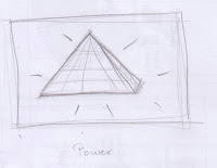
Got this idea from the Egypt's Pharaoh and the era. The symbolism of Power.
Personally I think there needs to have some common understanding between the illustrator and its target group. This is crucial in conveying the intended message across.

Got this idea from the Egypt's Pharaoh and the era. The symbolism of Power.


Personally I think there needs to have some common understanding between the illustrator and its target group. This is crucial in conveying the intended message across.
Friday, March 5, 2010
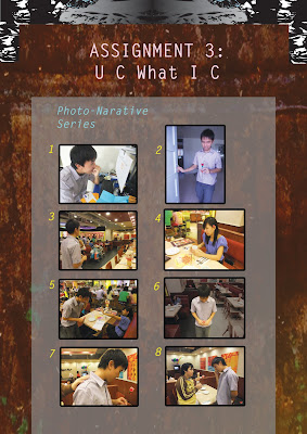
U C what I C
This is one of my favourite assignment of all, maybe it's because I get to use my camera.
Developmental Process


- different scenes taken-


- focus in the centre- - zoomed in-
Scene 5: Finding the girl

 - applying the rule of third, with the male protagonist on the 1st third, and the girl on 3rd third-


- over the shoulder scene-


Scene 7: Mistaken


Scene 8: Disappointed

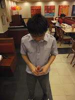
- top down to convey the disappointment-
Scene 9: Building up to climax


I had various concepts:
1) A person saw a pickpocket taking a businessman's wallet, went up to him, pickpocket pleaded and gave him the wallet before running away, the person then smiles and kept the wallet because he himself is a pickpocket too.
2) 2 childhood friends who havent been seeing each other since very young have been exchanging letters and decided to meet up, but the guy found the wrong girl and is embarassed, until he got found by the right one.
There were so many other random ideas I had, it was so difficult to make a decision. I ended up choosing the 2nd one since it was near Vday then.
Developmental Process
I took various shots at various angles, in total there were 12 scenes, of which, i cut down to 8 scenes.
scene 1: The day has arrived


Scene 2: Recalling the childhood times


- different scenes taken-
Scene 3: Taking the item of recognition


Scene 4: Entering the restaurant

- focus in the centre- - zoomed in-
Scene 5: Finding the girl


Scene 6: The "right" girl


Scene 7: Mistaken


Scene 8: Disappointed


- top down to convey the disappointment-
Scene 9: Building up to climax


- hands ocupying the third (golden rule)-
Scene 10: The right one


- Centre of attention, occupying the space with empty spaces around-
And after a lot of decision-making, this is the final story plot:


Critics said:
~ The mails (1st scene) could be more obvious by using the air mails (red white blue) so that it's clearer to depict the penpal relationship.
~ Having a twist might actually be better, for instance, instead of finding the girl, the male protagonist ended up meeting an old lady and realise he has been exchanging letters with an old lady all these while.
I actually like that idea, hope I can find actors and actresses for it though. =/
Subscribe to:
Comments (Atom)